If price stays in a range while the strategy is built for a trend, entries turn into a series of false breakouts and fees.
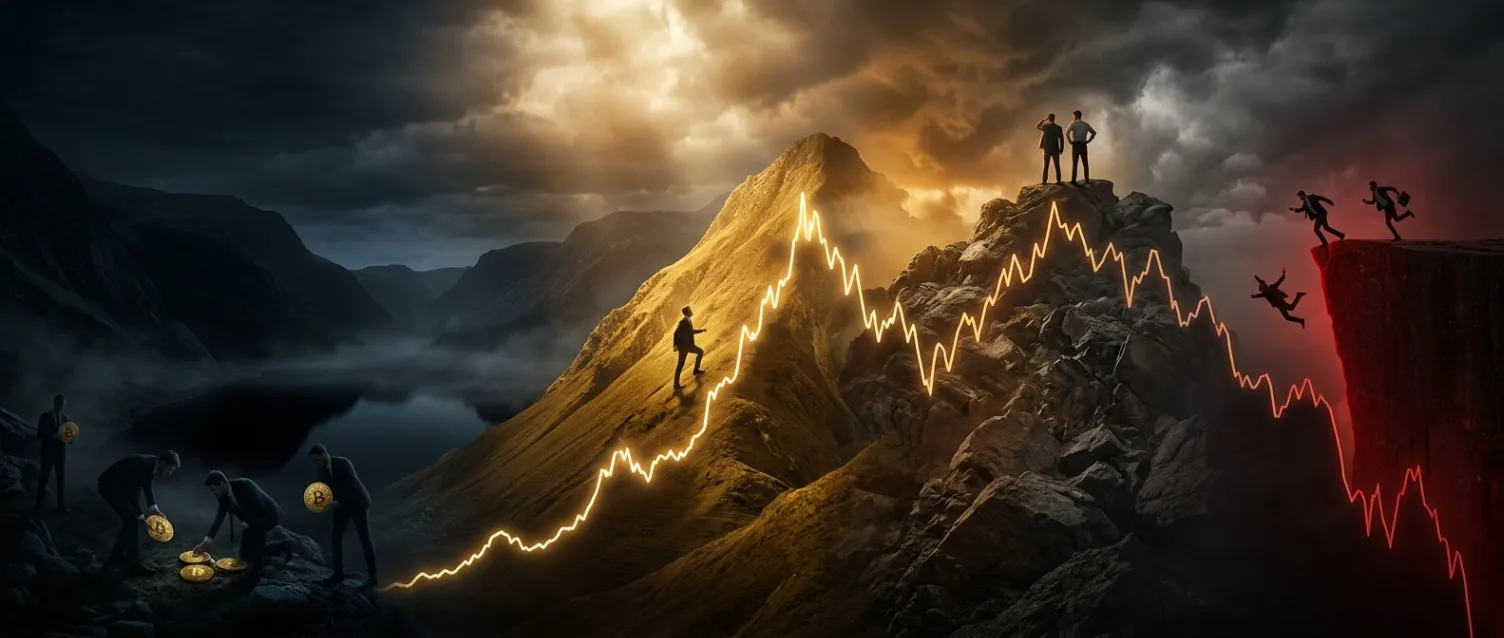
Cycle Model: Accumulation → Growth → Distribution → Decline
The cycle model divides the market into four phases by the shape of price movement and by the source of liquidity: position building at the bottom of the range, trend growth, selling in the upper zone, and decline with liquidations and panic selling.
The Wyckoff approach describes the same sequence of phases through the actions of large participants: buying at the bottom of the range (accumulation), supporting upward movement (markup), selling in the upper range (distribution), and downward movement (markdown).
In cryptocurrencies, transitions between phases often happen faster because of margin trading (trading with borrowed funds and leverage): when price moves sharply, liquidations turn a correction into a chain of forced closures.
Terms from this article appear in related CryptoTrade Wiki materials; the basic definitions are collected in the article “Trading for Beginners”.
| 🔁 Phase | 💰 Price | 📊 Volume | 👥 Participant Behavior | ⚠️ Typical Interpretation Mistake |
|---|---|---|---|---|
| Accumulation | Range after a decline | Low, with spikes on dips | Buying into weakness, lower seller aggression | Mistaking a long range for a lack of growth potential |
| Growth | Uptrend | Growing on impulses | Trend-following buying, rising speculative demand | Increasing risk on a late impulse |
| Distribution | Upper range, choppy moves | High on rallies without follow-through | Selling into strength, collecting liquidity near highs | Mistaking the upper range for a pause before continuation |
| Decline | Downtrend | Peaks during panic, then fading | Forced selling and liquidations, risk-off exits | Buying only because price has fallen sharply |
In this article, a crypto market phase means the current price regime: a range or a directional move, as well as where the main volume is concentrated — in which assets and trading pairs.
Why the Crypto Market Repeats the Same Phases Again and Again
On Bitcoin and Ethereum charts, the same sequence often repeats: a range after a decline, growth, a range near the highs, and then a new decline.
The goal of this material: to show why the same actions produce different results in different market phases: when entries work more often, when holding a position makes sense, and when the market punishes even signals that look correct.
A market cycle is a recurring sequence of phases in which buyer and seller behavior changes. After a decline, the market gradually stops being sold. In growth, buying becomes stronger. Near the highs, selling starts to outweigh demand. In decline, downward movement accelerates because of forced position closures.
- Speed of price movement. In a range, price moves between levels, while in a trend, movement accelerates and goes in one direction.
- Size of fluctuations. In calm phases, movements are smaller, while in trends and turning points, fluctuations become sharper and deeper.
- Participant behavior. After a decline, many exit positions out of fear; in growth, they buy because of the move itself; near the highs, they buy because growth continues; and in decline, they sell because of liquidation risk.
- Liquidity. In active phases, it is easier to exit a position because volume is high, while in a fading market, trades move price more strongly.
In cryptocurrencies, cyclicality is intensified by three factors: widespread use of leverage, rapid switching of speculative demand, and constant capital rotation between Bitcoin, Ethereum, and altcoins.
Using the same entry and exit logic in different phases. What works in growth often produces losses in the upper range or during decline.
The same indicator signal produces different outcomes if it appears in the lower range after a decline or in the upper range after growth.
Mini Cycle Map: What Changes in Each Phase
The mini map tracks three things for each phase: the shape of price movement, the source of liquidity for trades, and the type of risk that dominates this part of the cycle.
Support is the level below which price previously did not fall. As long as price stays above this level, the situation is considered stable. If price moves below it, the market usually enters another phase.
| Phase | Price Shape | Liquidity Source | Dominant Risk | Typical Participant Action | Typical Mistake |
|---|---|---|---|---|---|
| Accumulation | Lower range | Volume spikes on dips inside the range | False downside breaks and a long-lasting range | Buying in parts inside the range | Waiting for the perfect bottom and missing the upside breakout |
| Growth | Uptrend | Impulse buying and buying corrections | Overheating from leverage and late entries | Holding the position with the trend | Increasing leverage when pullbacks become deeper |
| Distribution | Upper range | Impulse buying near the highs | Sharp breaks of support after a series of false breakouts | Selling into strength and cutting exposure | Holding a position without a profit-taking plan in the upper range |
| Decline | Downtrend | Liquidations and panic selling | Cascades of forced closures and falling liquidity | Reducing risk and waiting for stabilization | Averaging into a falling market during downside acceleration |
A phase does not describe the picture on the chart, but a section of the cycle where a specific source of liquidity dominates: buying into weakness, buying with the trend, buying into overheating, or forced selling.
This table is needed as a quick filter: first the phase is identified, and only then is it checked whether the signal fits and which level will be the error point.
Phase diagnosis requires four data sources: the shape of spot price, trading volume, derivatives load, and blockchain supply distribution.
How to Identify a Phase: Signals from Price, Volume, Derivatives, and On-Chain
The same price level being high or low does not define the phase. The phase is defined by the combination: where price sits relative to a range or trend, how volume behaves on impulses and corrections, how open interest in derivatives changes, and how coin flows to exchanges change.
Price and Movement Structure
An uptrend is defined by a sequence of higher highs and higher lows. A downtrend is a sequence of lower highs and lower lows. A range is defined by price returning inside the boundaries after breakouts. An extremum is a local price peak or bottom on the chart.
- Level breakout. A breakout is confirmed when the level holds after a retest.
- Correction. In a trend, a correction is over when price stops making new extremes against the trend.
- False breakout. A false breakout is recorded when price quickly returns into the range and closes inside it.
Price structure answers the question: is the market in a range or in a trend, and in which direction the extremes are being updated.
Trading Volume and Market Depth
Trading volume shows the activity of buyers and sellers in the tape. Order-book depth shows how many limit orders stand near price and how much slippage a market order will get.
- Climactic volume. A volume peak on a rally without continuation often matches selling into strength.
- Spikes on dips. In the lower range, a volume spike on a decline means that opposing buying is absorbing sales.
- Dry corrections. A correction with falling volume means weak seller aggression during the pullback.
Volume and order-book depth answer the question: is the move supported by real trades and liquidity, or is price collapsing because of a thin market.
Derivatives: Open Interest and Funding
Derivatives show how many leveraged positions are open in the market and how much the price move depends on leverage. Open interest (OI) reflects the total amount of such positions, while funding shows which side of the market is overloaded. When leverage becomes excessive, even a normal pullback can accelerate sharply.
- OI rising during a rally. More leverage is entering the market, and a correction can trigger forced closures.
- Strongly skewed funding. One side of the market is overloaded, and a move against it accelerates.
- Sharp OI drop. Position closures happen in a chain and amplify price movement.
Derivatives help show where price movement is supported by real demand and where it relies on leverage and becomes fragile.
On-Chain: Coin Flows and Holder Behavior
On-chain metrics show coin movement between wallets and exchanges. Inflows to exchanges increase available sell-side supply, while outflows from exchanges reduce available exchange supply.
- Exchange reserves. A decline in reserves means part of the coins is being withdrawn from exchanges to external wallets.
- Realized price. Realized price is the average price at which coins last moved between wallets; trading below this level means many holders are in unrealized loss.
- Share of long-term holders. A rising share means coins stay inactive for longer.
On-chain data answers the question: is sell-side supply growing through inflows to exchanges, or shrinking through outflows from exchanges.
If at least two data sources contradict each other, the phase is better treated as transitional, and a level breakout should not be treated as confirmed.
Rising volume, rising OI, and sideways movement mean different processes in the lower range after a decline and in the upper range after growth.
The Same Signal, Different Processes: How Not to Confuse the Phase
The table below connects the same observable fact — volume, OI, a sideways range, a breakout, or news — with the cycle phase in which that fact usually appears.
| Observable Fact | Accumulation | Growth | Distribution | Decline | What to Check on the Chart |
|---|---|---|---|---|---|
| High volume | Absorption of selling in the lower part of the range | Support for impulse moves on breakouts | Selling into strength near the upper boundary | Capitulation selling and liquidations | Where volume formed: on the breakout, on the pullback, or near the range boundary |
| OI rise | Return of leverage as price stabilizes | Leverage builds with the trend | Leverage overload near the highs | Attempts to catch the bottom with leverage | Funding and price reaction to a pullback |
| Sideways range | Lower range after a decline | Consolidation inside an uptrend | Upper range after growth | Pause after panic before a new range | Where the range is located: near the bottom, in the middle of a trend, or near the top |
| Level breakout | Exit from the lower range | Trend continuation | False breakout to collect stops | Bounce in a downtrend | Whether the level holds after a retest |
| Positive news | Acceleration of the exit from apathy | Support for trend buying | News-driven rise without follow-through | Short bounce without a trend change | Whether the move continues after the first reaction |
A fact from the table counts as phase confirmation only when it matches the price shape: lower range, uptrend, upper range, or downtrend.
A phase change usually becomes visible when price breaks a level and it becomes clear whether it will hold on the other side.
Phase Transitions: How the Market Changes Regime
A phase transition is read through a simple combination: a level breakout, price behavior after returning to that level, and the reaction of volume.
-
Accumulation → Growth
- What happens: price breaks upward out of the lower range.
- Check: the return to the level ends with price holding above it.
- Volume: active on the breakout, calm on pullbacks.
- Common mistake: treating growth as started before price has held above the level.
-
Growth → Distribution
- What happens: price remains near the highs, but growth slows down.
- Movement: upward bursts are replaced by deeper pullbacks.
- Volume: spikes on rallies without continuation.
- Common mistake: taking the upper range for a pause before trend continuation.
-
Distribution → Decline
- What happens: price moves below support of the upper range.
- Check: the return to the level ends in rejection.
- Volume: increases on the move downward.
- Common mistake: expecting growth to return after the support break.
-
Decline → Accumulation
- What happens: price stops accelerating downward and starts holding inside a range.
- Behavior: dips are bought faster than before.
- Volume: panic spikes become less frequent.
- Common mistake: taking the first bounce for a market reversal.
A level breakout by itself does not mean a phase change. The deciding sign is whether price holds after returning to the level.
If a breakout has already happened but there has been no retest yet, the phase is better treated as undefined, and the plan should not be built as if the trend were confirmed.
Accumulation appears after a decline, when price stops accelerating downward and holds inside a range.
Accumulation: How the Lower Range Forms
The accumulation phase is defined by a lower range after a decline and by volume spikes on dips that end with price returning back inside the range.
Accumulation is a regime in which seller pressure weakens: declines inside the range do not develop into new lows because opposing buying absorbs the selling. On the chart, this looks like a series of pullbacks downward followed by quick returns into the range.
✅ What Makes the Phase Convenient for Building a Position
- Risk limited by a level. The lower boundary of the range sets the price below which the range-holding thesis stops being valid.
- Stable average price. Building the position through several purchases inside the range reduces dependence of the average entry price on a single buying day.
❌ What Makes the Phase Difficult
- Range duration. Price can stay at the bottom of the cycle for a long time, so early purchases may take a long time to produce upward movement.
- False downside breaks. Inside the lower range, sweeps below support with a quick return happen often.
Example (Bitcoin after 2018): after a strong decline, price stayed in a range for a long time, and sharp dips often ended with a return back inside the range, matching selling absorption by opposing buying.
DCA means buying equal amounts at equal time intervals; an even buying schedule reduces the impact of a single purchase date on the average entry price.
Growth begins when price breaks out of the lower range and holds the broken level on a retest.
Growth: How a Bull Trend Develops and Where Overheating Appears
The growth phase is defined by an uptrend: price makes new highs, corrections end above previous lows, and volume rises on impulses.
In cryptocurrencies, growth is often accompanied by demand rotation: first Bitcoin rises as the most liquid asset, then demand strengthens in Ethereum, then demand moves into large-cap altcoins, and then into more risky segments.
ATH (All-Time High) is recorded when price makes a new historical high. At new ATHs, the share of impulse buying often grows, which increases the risk of a sharp pullback at the first signs of selling into strength.
Overheating in Growth: Where Fragility Appears
Growth becomes fragile when leveraged positions build faster than exit liquidity grows. This can be seen in rising OI and persistently positive funding.
- Leverage growth. Rising OI increases the volume of positions that can be closed by force during a pullback.
- Impulse deterioration. Upward impulses become shorter, while pullbacks become deeper.
- Buying near highs. Rising volume near upper levels without continuation matches selling into strength.
Example (Ethereum 2020–2021): the growth was accompanied by accelerating impulses and increasing activity, while the late stage produced deeper pullbacks and choppy volatility typical of the upper zone of the cycle.
If growth is already underway, the key question is not the pullback itself, but whether it will break the last trend low and turn growth into an upper range.
Distribution begins when price holds near the highs, but each new upward burst quickly fades.
Distribution: Why Growth Stops Working
This phase usually looks like an upper range: price moves sharply upward, but almost immediately pulls back, and new highs do not produce continuation.
In such a situation, good news often causes a short spike without further growth, while negative events lead to sharper downward movement. If the market also contains many leveraged positions, an ordinary pullback turns more quickly into a chain of forced closures.
✅ What Can Usually Be Done in Distribution
- Exit into strength. In the upper zone, there is often enough volume to sell part of the position without severe price deterioration.
- Use the boundaries. Support of the upper range gives a clear level after which the growth scenario stops being relevant.
❌ What Makes the Phase Dangerous
- False upside breaks. Short breakouts upward often end in a sharp reversal.
- Illusion of continuation. Moves look like a return of growth, but are quickly suppressed by selling.
Example (Bitcoin 2021): after making new highs, price moved for a long time in an upper range with sharp bursts and pullbacks, and a breakdown of that range support became the start of the decline.
Staged profit-taking means selling the position in parts across a series of rallies; this reduces dependence on one exact exit moment.
Decline begins when support of the upper range is broken and a retest of that level ends in rejection.
Decline: Liquidations, Panic Selling, and Liquidity Compression
A bear market is a downtrend in which price forms lower highs and lower lows. In cryptocurrencies, decline is often reinforced by margin trading: downward movement closes leveraged positions through liquidations, and liquidations add market selling.
The late stage of decline often includes capitulation: a sharp acceleration downward, a volume spike, and a series of liquidation wicks. After capitulation, activity usually falls: volume declines, ranges narrow, and price stops accelerating downward.
Why Altcoins Fall Faster in Decline
Altcoins usually have lower liquidity, so a market sell order moves price more strongly through the order book. In decline, this leads to greater slippage on exit and deeper drawdowns compared with Bitcoin.
- Spread and slippage. As liquidity falls, the spread widens and the average selling price worsens.
- Synchronized declines. In panic, correlations rise, and most assets fall at the same time.
Buying during downside acceleration matches a phase where forced selling dominates. Without signs of a range and without the end of new low formation, buying remains a bet against the downtrend.
If price keeps making new lows and volume flares up on declines, the market is still operating under a forced-selling regime, and buying remains premature.
Price movement in cryptocurrencies is created by different groups of participants: retail, market makers, large capital, and derivatives participants.
Participant Structure: Who Creates Liquidity and Why Wicks Appear
The same level on the chart works differently if trades are dominated by retail market orders or by market-maker limit orders. The difference is visible in volume, the speed of price return, and slippage.
Retail
Retail consists of private market participants trading relatively small size. They often buy after a series of green candles and sell after a series of red candles, creating liquidity at extremes: buying near highs and selling near lows.
- Chart footprint: impulsive candles and rising volume in the late stages of a move.
- Risk: impulse entries often coincide with zones where selling into strength begins.
Market Makers and Arbitrage
Market makers constantly place buy and sell orders near the current price and earn on the difference between them. Arbitrage quickly removes price discrepancies between exchanges, so price often returns back after sharp moves.
- Chart footprint: a sharp move quickly pulls back toward the level.
- Risk: obvious levels are often pierced to collect orders and stops before price returns back.
Large Capital
Large capital cannot buy or sell large size in one order without moving price strongly. To build or exit a position, it uses periods of high volume and active demand.
- Footprint: high volume on rallies without continuation.
- Risk: growth near highs provides liquidity for selling, not a guarantee of trend continuation.
Derivatives Participants
Derivatives add leverage. During a pullback, leveraged positions are closed by force, and those forced closures add market orders that accelerate price movement.
- Footprint: sharp moves together with a drop in OI.
- Risk: during phase transitions, a correction more often develops into a cascade of closures.
If the market shows a sharp burst and an equally fast pullback, this more often signals a fight for liquidity between groups, not a trend change.
Capital rotation is the gradual flow of money between market segments. Within the cycle, it is usually visible in the growth sequence: first Bitcoin, then Ethereum, and only then altcoins.
Capital Rotation: Bitcoin, Ethereum, Altcoins, and “Altseason”
Rotation arises because of differences in liquidity and risk: Bitcoin has the deepest market, so large demand first concentrates in BTC. When growth in BTC slows, part of capital moves into ETH, and then into altcoins, where price swings are stronger.
Bitcoin dominance (BTC dominance) is the share of Bitcoin capitalization in the total crypto market capitalization. Rising dominance means BTC is growing faster than the market as a whole. Falling dominance means altcoins are growing faster than BTC.
Altseason
Altseason is a period when many altcoins grow faster than Bitcoin. It more often appears in the late part of growth, when demand shifts from the most liquid assets into riskier ones.
- Early sign: slower BTC growth together with accelerating ETH and large-cap altcoins.
- Late sign: growth in low-liquidity coins with heavy slippage.
- Risk: on a market reversal, low-liquidity altcoins give a worse exit price.
If growth has already moved into low-liquidity altcoins, this more often means a late cycle stage and an elevated risk of a sharp reversal.
After decline, some altcoins never return to their previous highs because of low liquidity and disappearing demand.
Altcoins in the Cycle: Why Some Projects Do Not Recover
Altcoin risk consists of two parts: market-phase risk and the survival risk of the specific project. In decline, the second risk becomes more visible because of liquidity compression and disappearing demand.
Three Reasons for Deeper Altcoin Declines
- Thin order book. A market sell order sweeps through several levels and worsens the average selling price.
- Speculative demand. Without stable demand beyond hype, buying disappears faster.
- Capital rotation. On a market reversal, capital leaves altcoins for more liquid assets.
Minimum altcoin survivability criteria
- Liquidity. Volume and order-book depth allow exit without sharp slippage.
- Supply pressure. Unlocks and emissions create regular sell-side volume.
- Demand. The reason to hold the token is not limited to a short-term pump.
- Behavior during corrections. The asset holds up better than the market or falls faster than the market.
If at least two checklist points fail, the altcoin remains a hype bet rather than an asset with sustainable demand within the cycle.
The same position size produces different losses in accumulation and in distribution, because in distribution a break of upper-range support happens more often.
Risk by Phase: How the Cost of Mistake Changes
The cost of a mistake depends on the market phase: in a trend, pullbacks more often end with price returning upward, while in the upper range the same pullback more often breaks support and starts a downward move.
| Phase | Where Mistakes Most Often Happen | How Money Is Usually Lost | What to Watch |
|---|---|---|---|
| Accumulation | False exits from the range | Buying before a move downward without price returning | Lower boundary of the range |
| Growth | Overheating and excessive leverage | A pullback that knocks out leveraged positions | The last low in the trend |
| Distribution | Support breaks near the highs | Holding the position after price moves below support | Lower boundary of the upper range |
| Decline | Acceleration of the fall | Buying before price has stopped falling | Price shifting into a range |
The “What to Watch” column shows the level price should not move below or above. If price moved away and did not return, the phase has already changed.
The same trade looks identical on the chart, but has a different probability of success in the lower range and in the upper range.
Tactics by Phase: How to Link Entry, Holding, and Exit to the Price Regime
Tactics depend on whether price is in a range or in a trend. In a range, the main problem is false breakouts. In a trend, the main problem is the pullback and a break of the trend structure.
Long-Term Horizon
Described regime: holding a position for months and going through the full cycle.
- In accumulation: building the position in parts inside the range.
- In growth: holding with the trend and partial profit-taking on impulses.
- In distribution: cutting exposure in the upper range and as false breakouts become more frequent.
- In decline: reducing risk until a range appears and new low formation stops.
Trades Inside the Phase
Described regime: trades on impulses and corrections within the current phase.
- In growth: entering with the trend after a correction and confirmed level holding.
- In distribution: a higher share of false breakouts near the highs.
- In decline: bounces often remain part of the downtrend.
The same entry point can be valid in growth and wrong in distribution, so tactics start not with the entry, but with identifying the phase.
Most losses occur at phase-transition moments, when a participant keeps acting as if the market were still in growth while it is already stuck near the highs.
Typical Mistakes: Where Growth Is Mistaken for Continuation
Mistakes are most often linked to false moves: price breaks a level, creates the impression of growth, and then quickly returns back and fails to continue. How exactly the market uses such moves to collect orders is explained in detail in the article “Breakout and False Breakout: How the Market Collects Liquidity”.
-
Buying near the highs without an exit plan
- A short burst upward looks like the start of new growth.
- Price fails to continue and quickly returns back.
-
Adding to a position during a fall
- Buying continues even though price keeps moving lower.
- The average price improves, but risk grows faster.
-
Using leverage when the market is already overheated
- Many positions are open with borrowed funds.
- A normal pullback quickly turns into a sharp drop.
-
Buying assets with poor liquidity
- On exit, price moves worse than expected.
- Growth on the chart does not mean the asset can be sold at that price.
If the mistake has already been made, the main marker is the level: when price returns into the range after a sweep, the bet on continued growth stops being justified.
The anti-checklist tracks phrases and decisions that statistically align with buying in the upper zone and averaging into a downtrend.
Anti-Checklist: Signs of Incorrect Phase Identification
Phrases that often appear before a mistake
- “One pump means the bull market has started.” A breakout without holding after retest remains a weak sign of a phase change.
- “A sideways range at the top means strength.” The upper range often means distribution if impulses fail to continue.
- “The news is good — growth will continue.” In distribution, news creates an impulse without continuation.
- “It fell a lot, so it must be cheap.” In a downtrend, price keeps making new lows until a range appears.
- “I’ll add leverage to recover faster.” Leverage increases the probability of forced closure on a normal correction.
If at least two phrases from the list match, it is a reason to delay the decision and first check the phase by price and level.
The checklist helps compare the shape of price movement with the current market phase and assess how well the signals agree with one another.
Short Checklist: Checking the Phase Before a Decision
Verification points
- Price structure. Range or trend; whether highs and lows are updating in one direction.
- Level and retest. Whether there was a breakout and level holding after the retest.
- Volume. Whether volume rises on impulses and falls on corrections.
- Derivatives. Whether OI is rising, whether OI is falling, and whether funding is near neutral or skewed.
- Pair liquidity. Spread and order-book depth near price.
- Segment rotation. Whether growth is concentrated in BTC/ETH or has already shifted into altcoins.
If the points give contradictions, this means the market is in a transitional zone between phases, and the probability of false breakouts is higher.
The checklist is considered complete only when price structure and the level do not contradict volume and derivatives.
Each case shows how one of the cycle phases looks on a real chart and by which signs it can be recognized.
Historical Cases: How the Phases Look on BTC and ETH
Case 1 — BTC after a deep decline
- Price shape: lower range after a decline.
- Volume: spikes on dips with a return into the range.
- Transition: breakout of the upper boundary and holding after the retest.
Case 2 — BTC near the highs
- Price shape: upper range after a strong trend.
- Volume: high volume on growth without continuation.
- Transition: support break of the range and a failed retest.
Case 3 — ETH in the growth phase
- Price shape: uptrend with corrections.
- Volume: rising volume on impulses.
- Late-stage risk: deeper pullbacks and choppy volatility near the highs.
Case 4 — Altcoins in late growth
- Price shape: fast pumps and fast pullbacks.
- Liquidity: rising slippage on exits from low-liquidity coins.
- Transition into decline: synchronized segment decline after a BTC reversal.
The purpose of the cases is not to recognize a picture, but to repeat the same check: price shape, level, reaction after the return, and volume behavior.
The FAQ below answers the questions that most often arise when reading phases through ranges, trends, and derivatives.
Common Questions About Crypto Market Phases
How can accumulation be distinguished from distribution if in both cases price moves inside a range?
Accumulation usually appears after a decline and looks like a lower range, where dips return inside the range. Distribution usually appears after growth and looks like an upper range, where upward impulses give weak continuation and pullbacks become deeper.
Can the Bitcoin halving be used as a calendar for phase changes?
The halving affects the BTC issuance rate, but phase changes on the chart are confirmed by level breakouts, holding after retest, volume, and derivatives conditions. The halving date does not replace these signs.
Which signs of overheating appear most often in the late stage of growth?
The late stage of growth often includes rising OI, skewed funding, and deteriorating impulses: new highs are reached, but pullbacks become deeper and more often end with OI falling because of liquidations.
Why do altcoins fall harder than Bitcoin during decline?
Many altcoins have a thinner order book and lower liquidity, so market selling moves price more strongly. In decline, this creates greater slippage and deeper drawdowns.
What does DCA mean and why is it mentioned in the accumulation phase?
DCA means buying equal amounts at equal time intervals. In the lower range, this approach reduces the impact of one buying date on the average entry price, because the position is built through several purchases inside the range.
Why take profits in parts in the upper zone of the cycle?
Selling in parts spreads the exit across several days and reduces dependence on one exact exit day, which matters in the upper range with false breakouts and sharp pullbacks.
Why does the same strategy work in one part of the cycle and break in another?
A strategy built for a trend loses its statistical edge in a range because of false breakouts. A strategy built for a range loses its edge in a trend because of breakouts and accelerating movement.
The phase model reduces analysis to verifiable signs: range or trend, breakout or holding after retest, OI rising or falling, inflow or outflow of coins from exchanges.
Conclusion: How to Read the Cycle Through Phase Signs
The cycle consists of four phases: lower range (accumulation), uptrend (growth), upper range (distribution), and downtrend (decline). Each phase differs by its source of liquidity: buying dips, trend-following buying, buying near highs, or forced selling.
Phase transitions are confirmed by the level and retest: a breakout without holding after retest remains a weak sign. Derivatives add the risk of a closure cascade when rising OI and skewed funding coincide with a pullback.
The practical rule of the cycle is simple: first identify the phase by price and level, then check volume and derivatives, and only after that choose a tactic. If the signs contradict each other, the market is in a transitional zone and the risk of false moves is higher.